
6
min read
How I created a personal stylist's website, from finding the visual direction to launching on Tilda and receiving the first enquiries.
Client: Masha Plettser
Project: website for a personal stylist and personal brand architect
My role: structure, design, Tilda development, mobile adaptation, animation, forms, basic SEO and analytics setup
Client materials: copy, photographs and service descriptions
Timeline: up to two weeks
Project: website for a personal stylist and personal brand architect
My role: structure, design, Tilda development, mobile adaptation, animation, forms, basic SEO and analytics setup
Client materials: copy, photographs and service descriptions
Timeline: up to two weeks
The client and the context
Masha Plettser is a personal stylist who works with people's image and personal brand. Her services include image transformation, personal shopping, outfit creation, shoot styling and wardrobe support.
The client approached me while developing her personal brand and launching new services. She wanted to bring her offer together in one place, communicate her personality and professional standard, and let visitors enquire about a consultation.
The website primarily serves busy people looking for a personal stylist. They need to understand the specialist's approach, find a suitable service and take the next step quickly.
The brief
The website needed to do three connected jobs: introduce the services, build trust in the stylist and collect enquiries.
Visually, we looked for a combination of a premium feel, confidence and individuality. The client has a distinctive personal style, so the design needed to reflect her character and work with the photographs she supplied.
I was responsible for the structure, design and Tilda implementation. The client provided the copy and photographs, giving us a foundation for the sequence of sections and the visual concept.
Finding the concept
The hardest part was finding a design that matched how the client saw her own brand.
The initial concept evolved through our discussions. We revisited the opening screen, photo selection and composition. These changes helped clarify the impression the website should make at first sight.
The early layout and several opening-screen options are preserved in Figma. They show how the composition and emphasis changed as we worked towards the final direction.
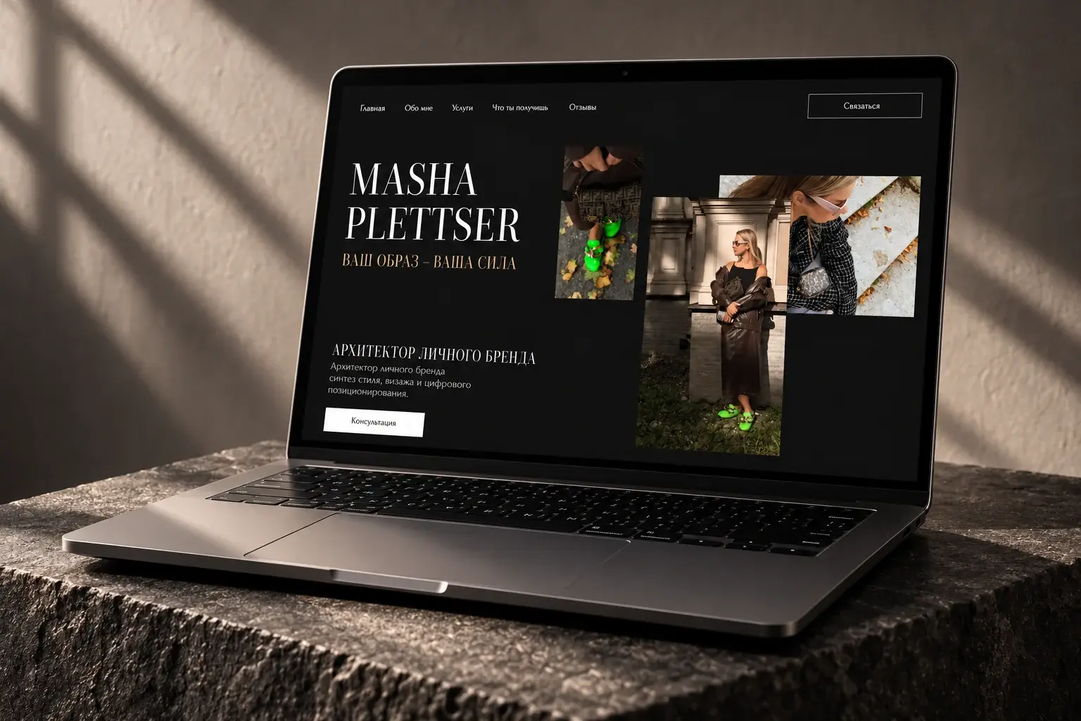
The final design is built around a dark background, large serif typography and photography. On the opening screen, images in different formats form an asymmetric composition, echoing the bold styling and creating a rhythm beside the large Masha Plettser name.
The restrained palette gives the photographs room to express their own accents: clothing textures, architectural surroundings and colourful outfit details.
Structure: from introduction to enquiry
I arranged the page as a clear journey: meet the stylist, discover her approach and services, then explore the outcomes of working together, testimonials and the enquiry form.
The opening screen introduces Masha Plettser and her specialism. The mission section explains her approach to personal image. This sequence gives visitors an understanding of the stylist before they choose a service.
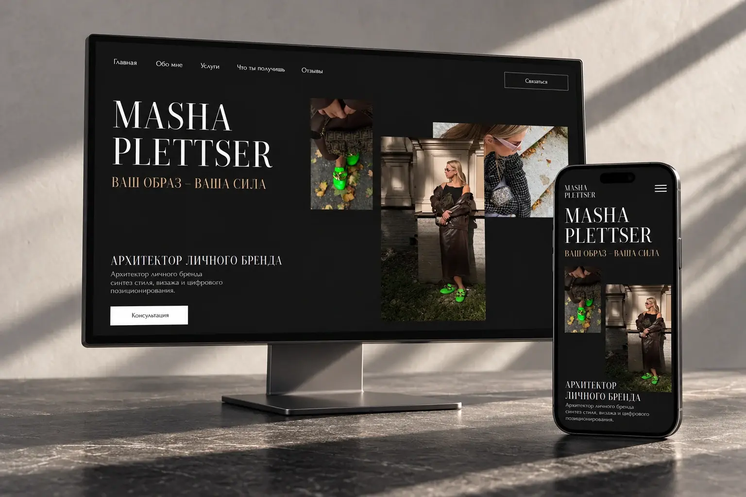
Responsive website design on desktop and phone screens.
I used a repeating service format: a name, a short description, an image and two actions — send an enquiry or read more.
Visitors can scan the services first, then explore the offer that interests them. Detailed information opens separately, preserving the flow of the main page.
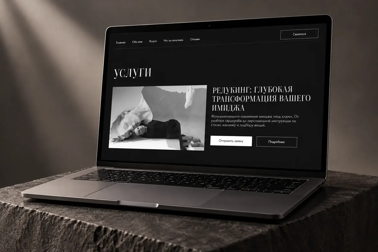
A concise service introduction with a separate link to the details.
The outcomes section explains what a client can gain from working with the stylist. Testimonials and an enquiry form follow, bringing the specialist, services and next step into a single journey.
Building on Tilda
Once the design was approved, I built the website on Tilda, added animation and configured enquiry forms. Enquiries go to email and Telegram so the client can receive notifications through convenient channels.
I also adapted the website for mobile devices. On smaller screens, the layout and scale change while the large typography, photography and overall visual character remain.
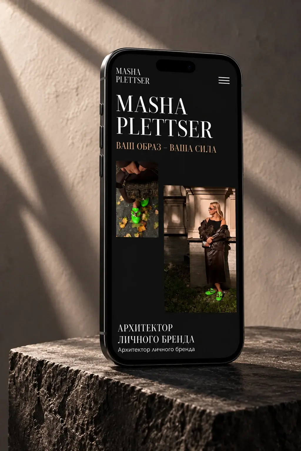
The mobile opening screen keeps the same visual emphasis in a vertical composition.
Before launch, I completed basic SEO setup and connected Yandex.Metrica, Yandex.Webmaster and Google Search Console. These tools provide a basis for monitoring traffic and search visibility.
The result
The project took up to two weeks. We went from the source materials and initial concept to a working website with a mobile version and configured enquiry forms.
The client said the website reflected her personality. The first enquiries arrived after launch. They were not counted separately, so the outcome at this stage is the first contacts with potential clients and positive feedback on the visual presentation.
For me, this project showed the value of a dialogue with the client. Discussing the opening screen, photographs and composition helped us find a design she recognised herself in.